
The West Michigan Graphic Design Archives (WMGDA) is a curated catalog of exceptional design work from West Michigan. Along with Baylee DeVos, I was tasked with improving the user experience of the archives for a number of users.
Defining User Paths
Front-End User
- Interact with website navigation most often
- Viewing projects, articles, and consuming the main content form on the website

"Middle-End" User
- Engage with forms to submit projects
- In contact with admins (back-end users) and provide the content viewed on the Archives website
- Function in between front and back-end users

Back-End User
- Manage and curate the content on the website
- Work with in the Wordpress dashboard the Archives is hosted on
Improving the Navigation
Discovering Opportunities
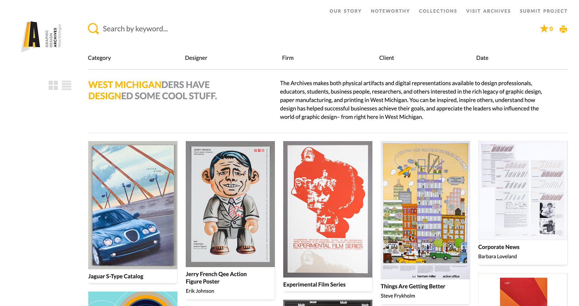
To help improve the experience for front-end users, we audited the current navigational structure to identify opportunities to create more clarity and accessibility of information.
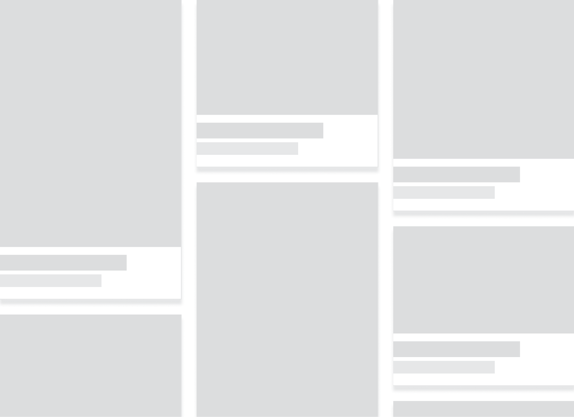
One of the first things we identified was the large amount of space the navigation header takes up, reducing the amount of space allocated for viewing webpage content.

We also found a large amount of content within a drop-down, filling up the entire viewport and requiring the user to scroll to see it all, making it hard to find specific entries.
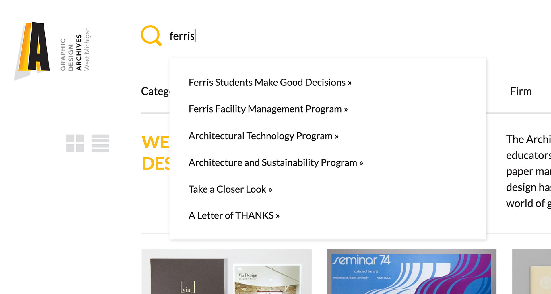
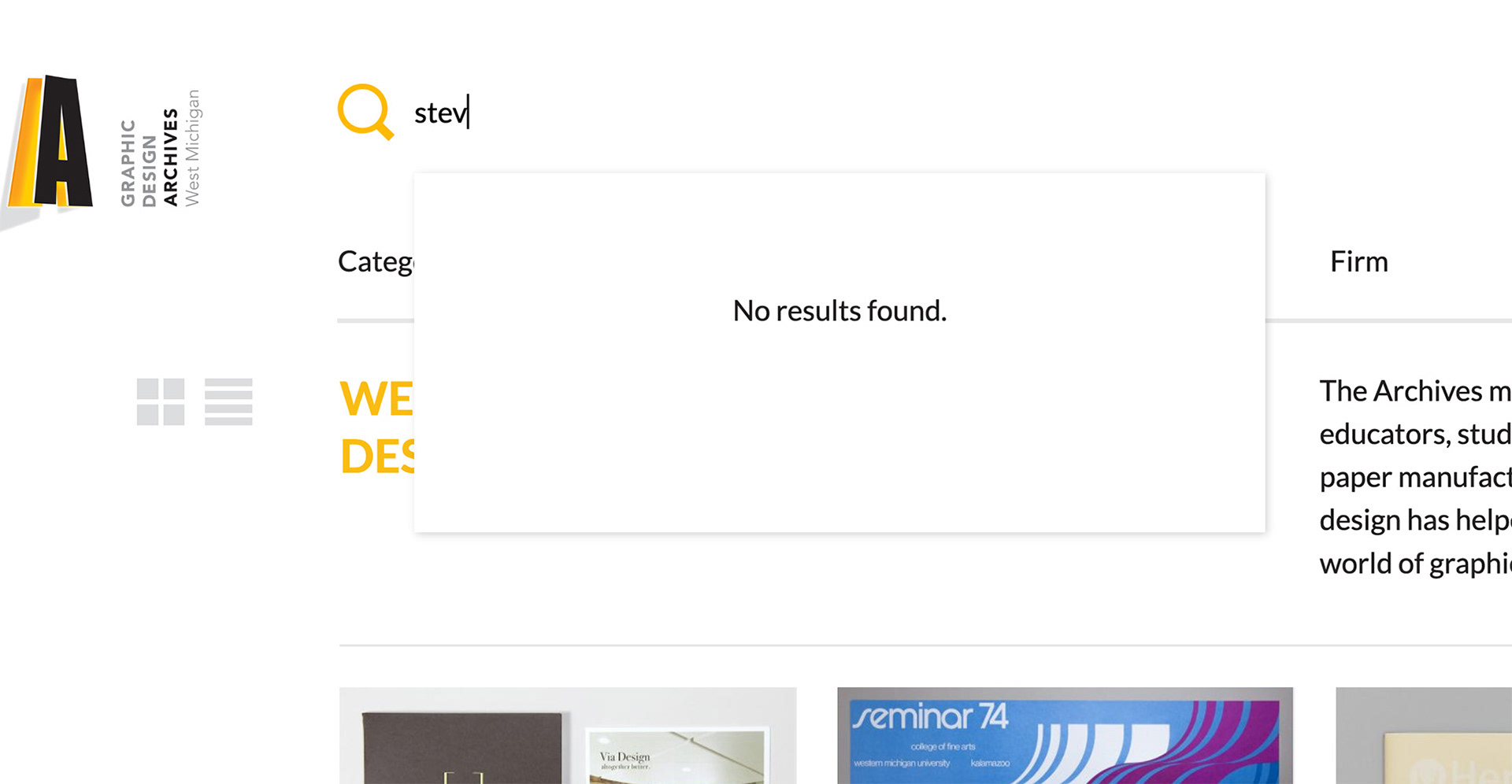
Using the search field, we identified issues locating information. Not only would partial terms not show results, but the results that did show would only be projects, overlooking other forms of content on the website.

Lastly, we found no explicit way to sort content on interior pages, which caused the order of projects displayed on the page to seem arbitrary.
Creating a Unified UI System
To improve the communication of information, we worked to standardize the typography and iconography strategies.
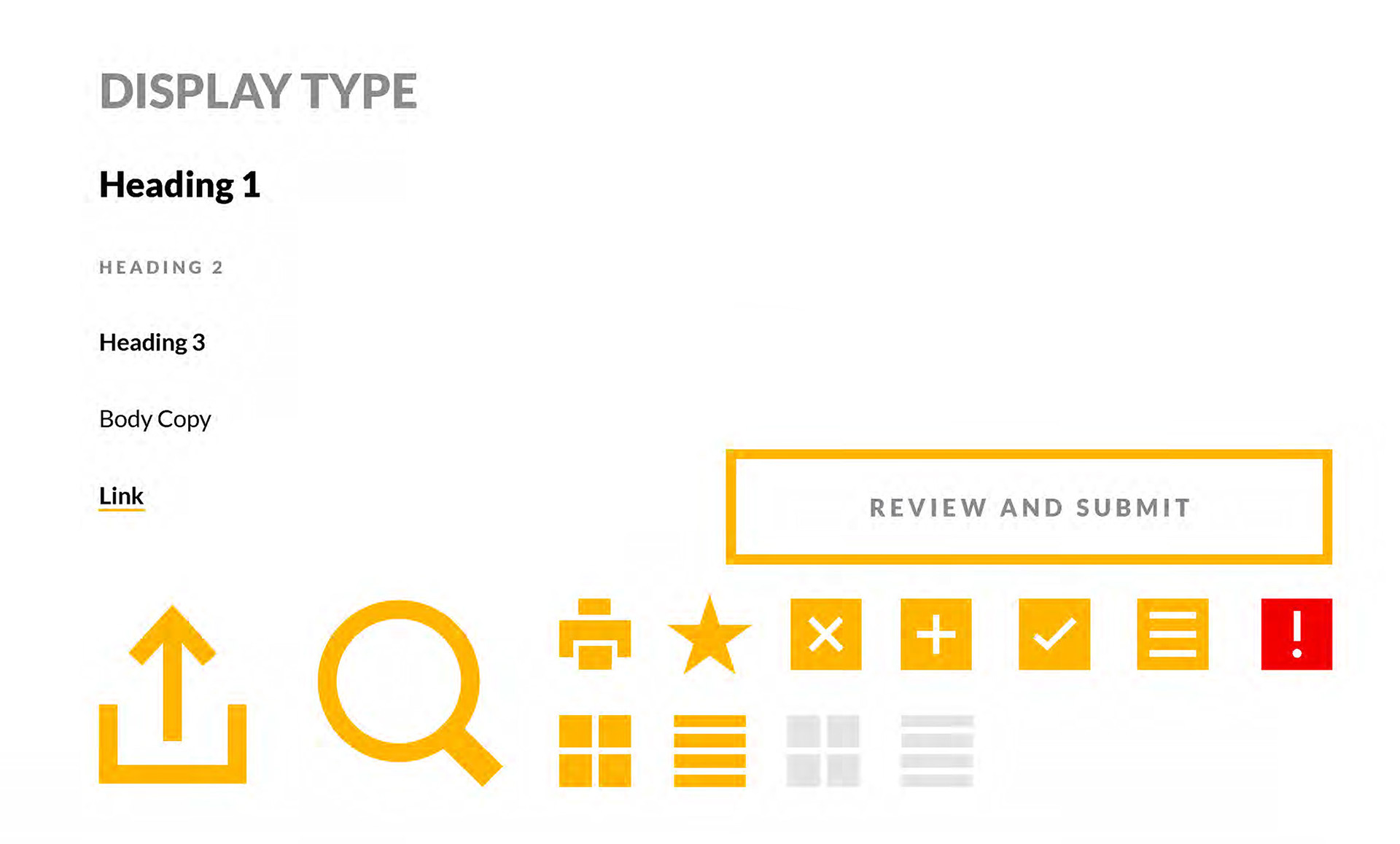
Using these components, we constructed navigation prototypes to solve the problems we identified in the current navigation.
Developing Prototypes

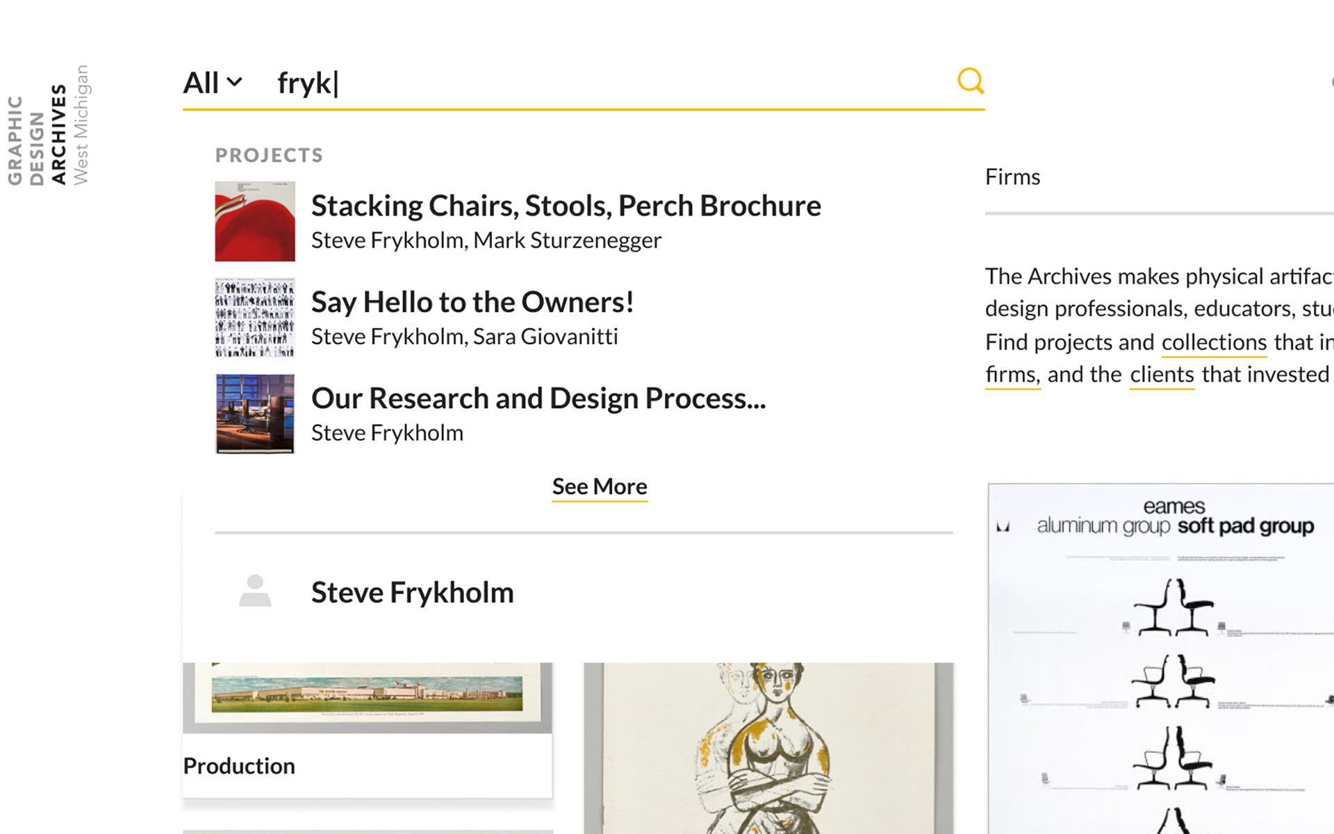
By expanding the content types present in the search results, we give users a full sense of the scope the Archives cover with its content.
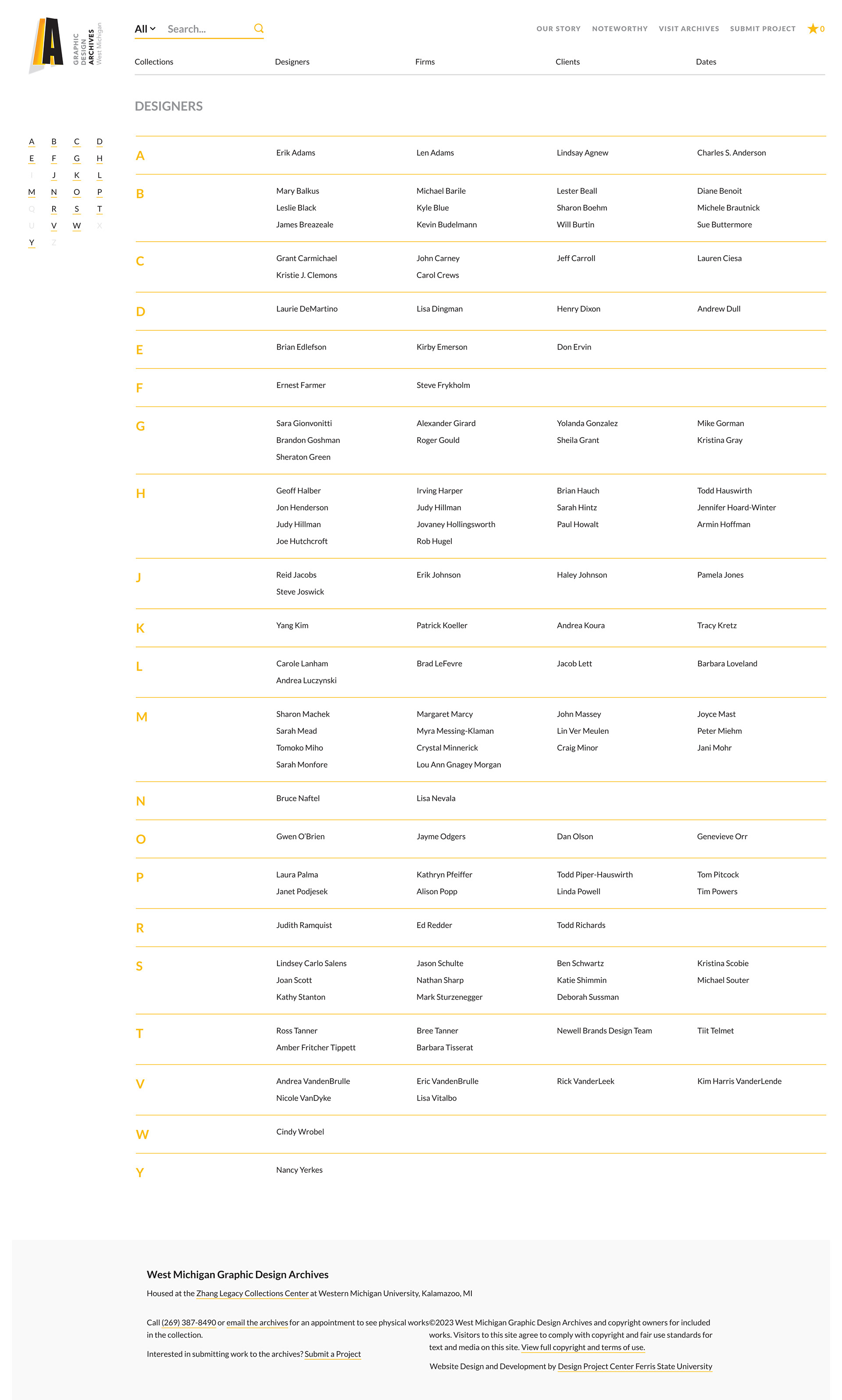
A new page type we introduce, the index page, gives the large contents of the drop-downs a new home that is much more accessible and digestible to users.
Updating the Forms
Testing the Current UX
To discover opportunities to improve the project and designer forms experiences for our "middle-end" users, we conducted some user tests. We asked users to go through filling out the forms and identify areas of success and needs for improvement.
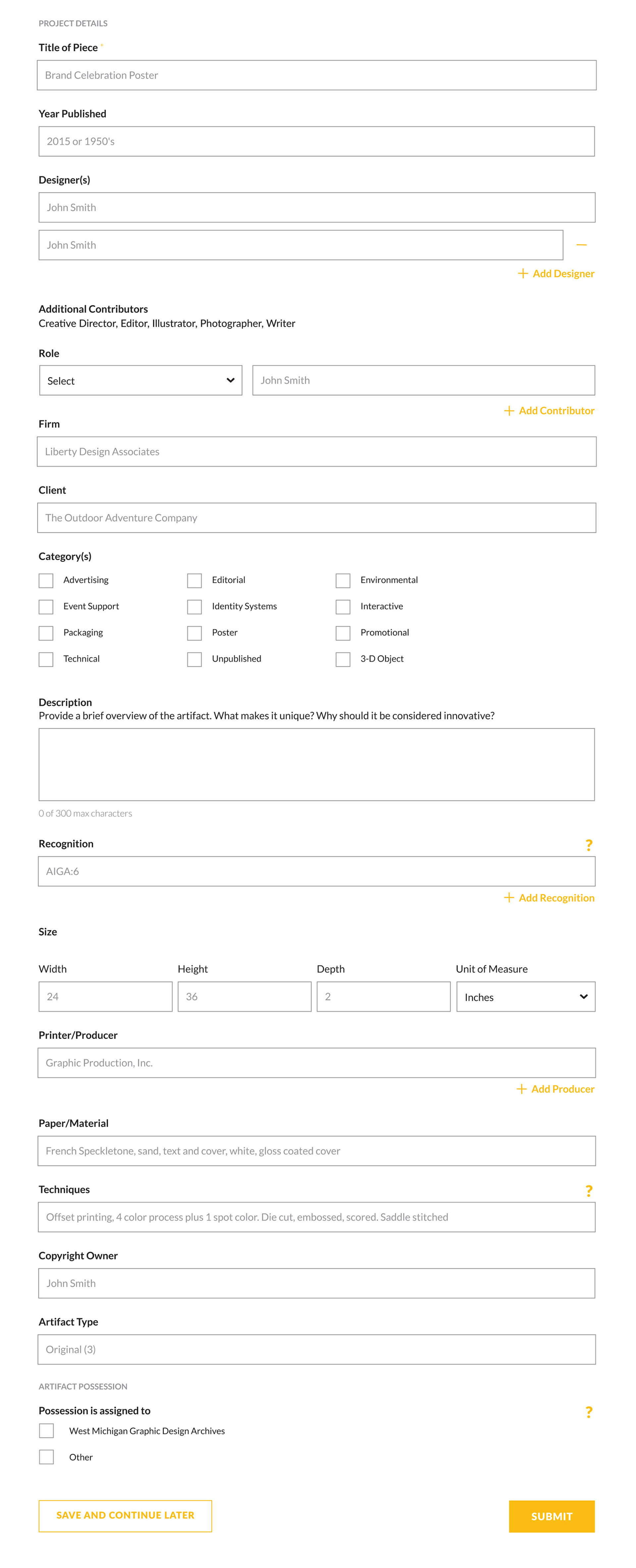
One of the first things our users identified was how content on the forms was one long continuous flow, and some sections or progressive disclosure of information would reduce their feelings of being overwhelmed.

Users also missed tool-tips that provided useful information to understand those fields even when being confused about the fields.

Having the save and submit buttons at the bottom, users were unsure whether they would have the ability to maintain progress in such a long form or whether they had the ability to review their responses before submission.
Responding to Feedback
After looking at the feedback we got from testing, I worked towards making changes to the form experience that would remedy problems and fit within the new UX and UI standards we were defining.
By adding an introduction and floating save button to the forms, we were able to give users more confidence in their ability to gather information and complete the form in multiple sessions, reducing uncertainty whether they would be able to complete it.
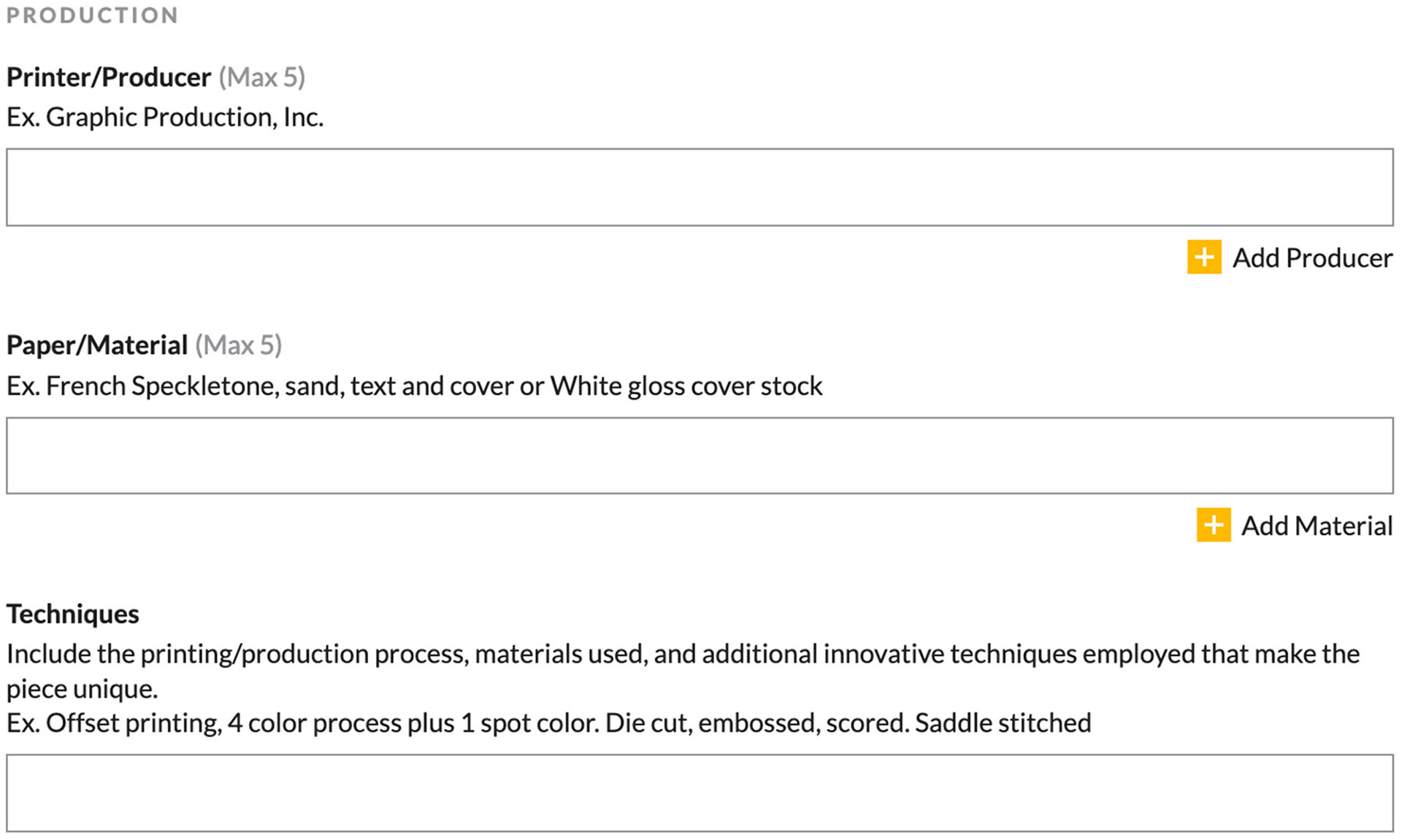
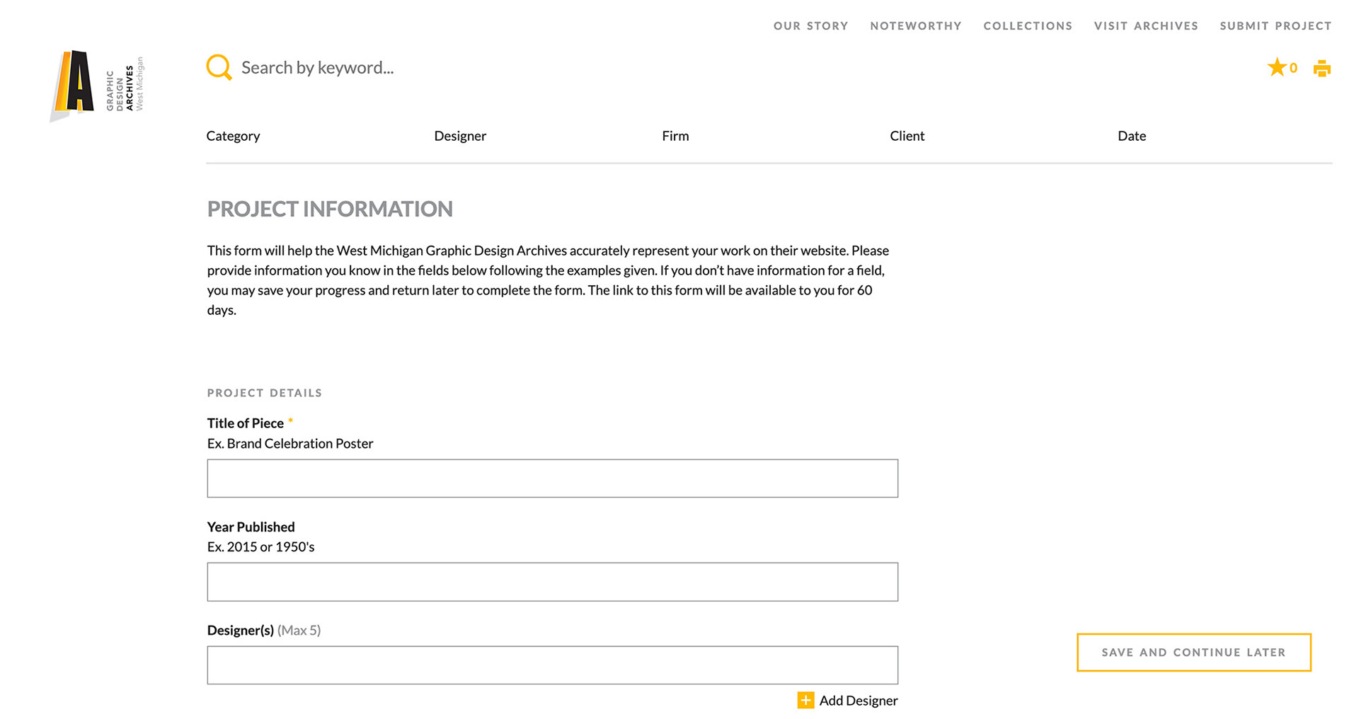
Creating clearly-defined sections using the typographic system we established, we chunked form fields into more comprehensible portions that provide users with more context.
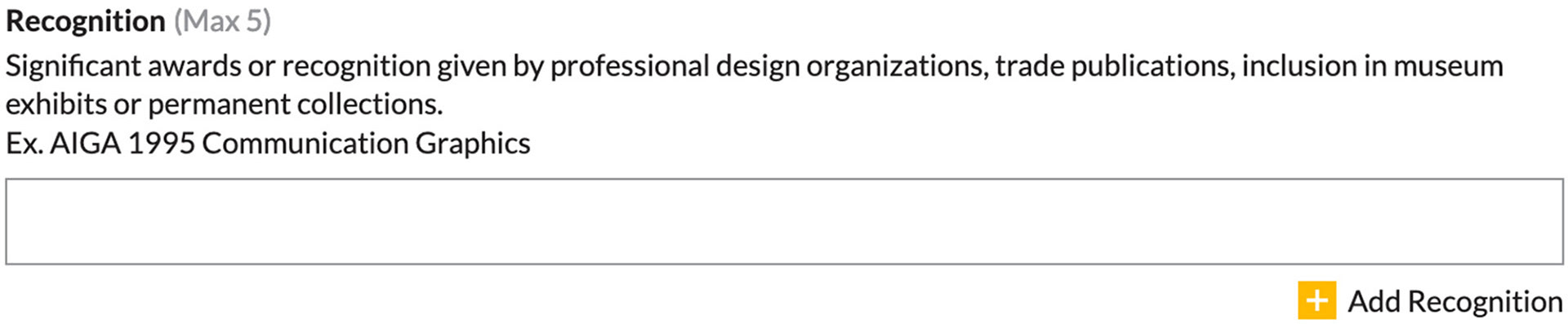
By moving information out of the placeholder text and tool-tips, users now had a permanent reference that helped provide further guidance in filling out form fields.

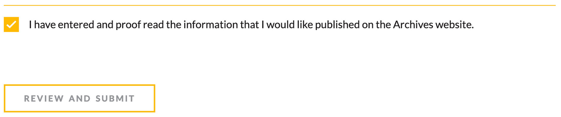
To ensure users feel confident in their entries into the form, a simple checkbox requires users to verify their entries before checking it and submitting the form.
Refining the Back-End Data
Identifying an Inconsistency
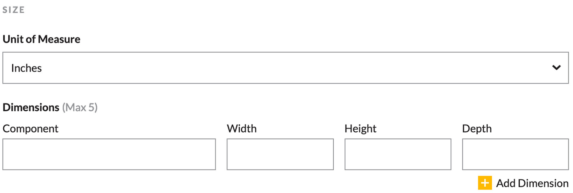
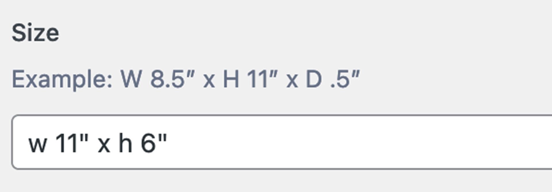
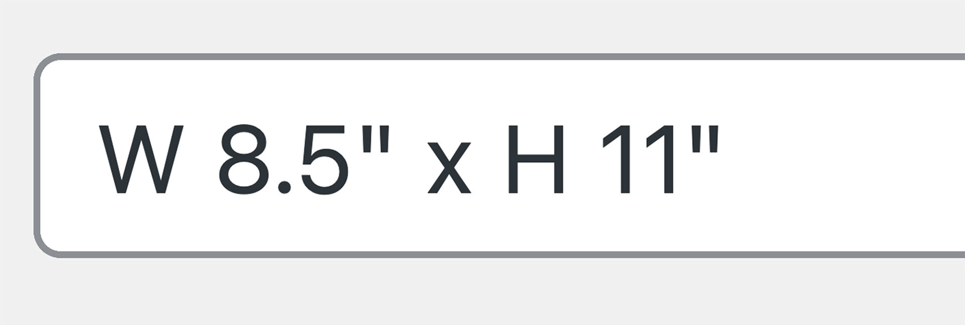
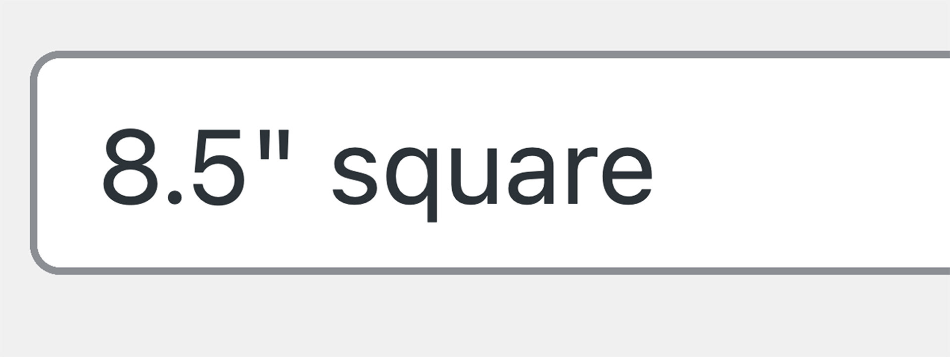
After improving the form experience, I noticed that the data structure from the forms was different than the input field structure in the back-end of the dashboard.
This caused inconsistencies in the size data and varying formats for project sizes.
Creating a Solution
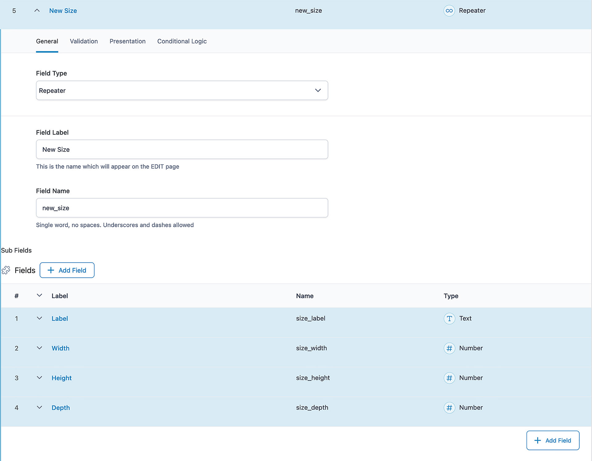
Working within the Wordpress dashboard database, I created a new data structure for size information that was more consistent with formatting established within the forms.
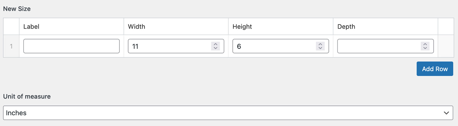

Using this new input structure, data is more secure and data structure is more consistent both on the back-end and on the front-end.