As a designer, it is important to be adaptable in our ability to communicate. Using a Reef retail product catalog, I worked with Baylee DeVos and Hannah Stites to turn a physical book into a conceptual digital experience that allows retailers to more easily access and utilize their catalog and order their stock from Reef.
Goals
Dynamic
As a physical artifact, the current catalog requires frequent new additions to be released. As a digital experience, the catalog should not require frequent updates and only require new products to be added and old products to be removed, making stock changes easy to make.
Unified
The current process for users requires them go through a lengthy process that has way too many unnecessary steps. With the new digital experience, it is a great opportunity to also shorten this process into a unified experience.
Assembling an Asset Library
Audit
To understand the current experience, our group took a deep dive into the current physical catalog, documenting type strategy, color strategy, imagery, language, icons, and any other design element used in the catalog.
We also took to the Reef website, which allowed us to retrieve specific hex codes for the colors used in their branding, as well as the exact typefaces they used. This enabled us to design within their existing branding.
Taking the assets we gathered and adding them into a Figma document, we translated them into Figma components in order to create iterations of interface designs and design system components.
Image Board
In order to get a better grasp on the visual tone and language the Reef brand had, we also created an image board to align our direction with what Reef had already established in their branding.
Prototyping
Once we gathered enough brand assets, we began creating possible atoms and molecules to use as part of our digital experience. To ensure this experience united both product browsing and purchasing, we created assets for both processes.
Creating the Digital Experience
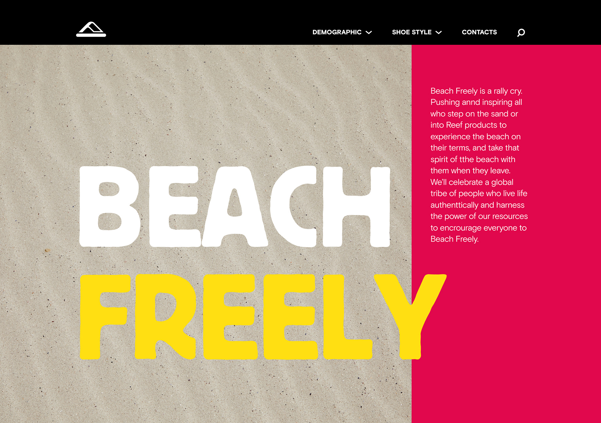
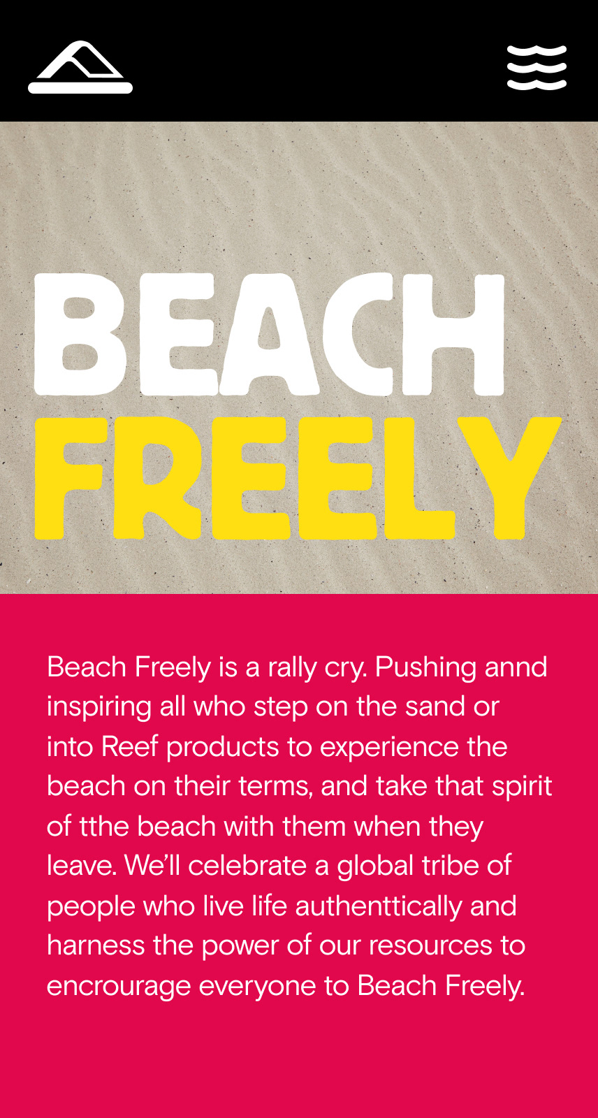
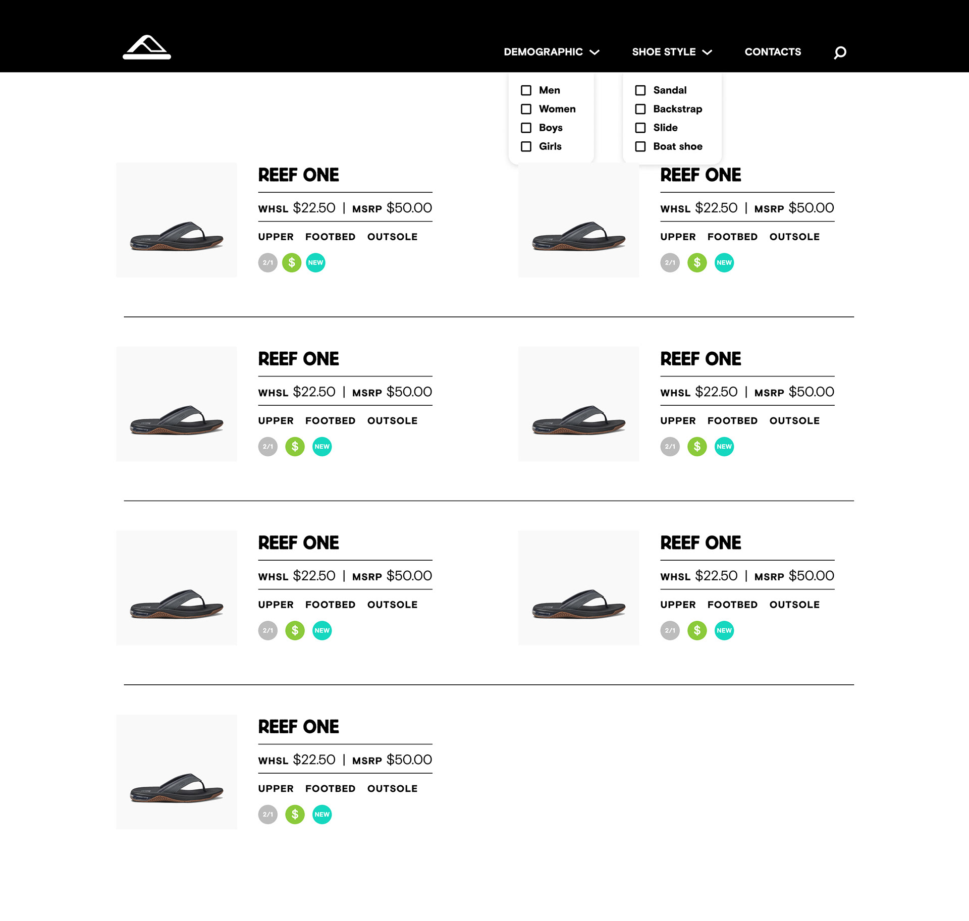
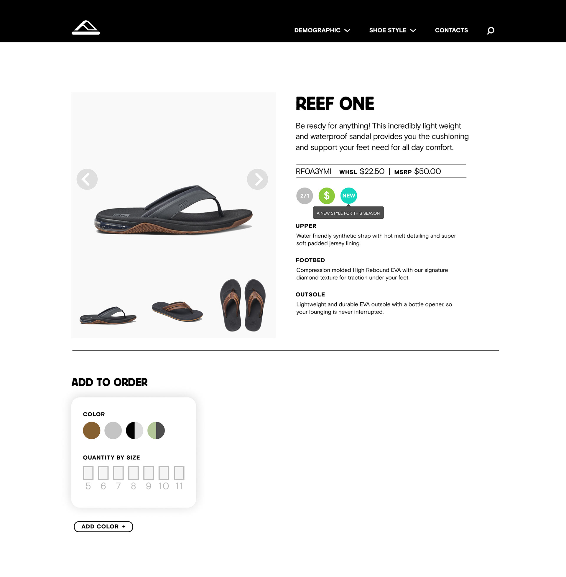
Once we established the basic components for screens, we continued the prototyping process and created screens for the final design.


The product list format is a simple layout that can easily be updated for a dynamic and ever-changing stock.


The add to cart function and product details are all built into one unified screen.
Extending the Brand
In addition to building the digital experience, we also worked on some touchpoints from the brand that would best compliment the new digital experience.
Developing a Functional Prototype
To effectively tackle coding and creating assets for a functional prototype, we split into two separate groups within our team. One was a one person team who focused solely on transporting and converting assets into a web-friendly format. The other team focused on coding the functional prototype, that being the team that I was a part of.
