Migrant workers are the backbone of the agricultural industry, consisting of almost half of the total agricultural work force, yet many are thrust into the American economic system with little to no help. To support our foreign work force, the conceptual financial service of Emigra will fill in that gap.
Defining Goals
Understanding Users
To better understand the users, I conducted secondary background research and user interviews to better understand the financial needs and goals. This helped me structure the experience of Emigra.
“On average, migrant workers send between US$200 and $300 home every one or two months. Contrary maybe to popular belief, this represents only 15 per cent of what they earn: the rest –85 per cent – stays in the countries where they actually earn the money, and is re-ingested into the local economy, or saved.”
- UN News, “Remittances matter: 8 facts you don't know about the money migrants send back home,” June 2019
Multiple sources indicated that migrant workers in the U.S. are predominantly from Mexico and live in poverty. This indicated to me that Emigra needed to be accessible to users who primarily speak Spanish, and should be a relatively inexpensive service with expertise in handling lower-income clients.
José Martinez
- Does not natively speak English
- 30s-50s
- Family-centric
- Dedicated
Using this information, I was able to identify important goals that Emigra had to fulfill to satisfy user needs:
These goals helped me create a holistic and fulfilling experience.
So... Who is Emigra?
Visual Strategy
In order to develop the UX of Emigra, I needed to first establish the brand system. These components, compiled in a brand manual, helped create a cohesive system that lead to an easier development process of the service and user experience.
To symbolize Emigra's value of growth and connection to agriculture and nature (through the clients), I used green in the brand's color strategy.
Apertura
ABCDEFGHIJKLMNOPQRSTUVWXYZ
abcdefghijklmnopqrstuvwxyz
abcdefghijklmnopqrstuvwxyz
Apertura is a friendly and readable typeface that makes any content using this typeface easily accessible to the user.
Emigra means “emigrate” in Spanish. Our primary users are spanish-speaking immigrant workers in agriculture, so the brand name and mark indicate our intention to work with immigrant workers.
The arrow replacing the eye symbolizes Emigra's ability to improve their users' financial situations.
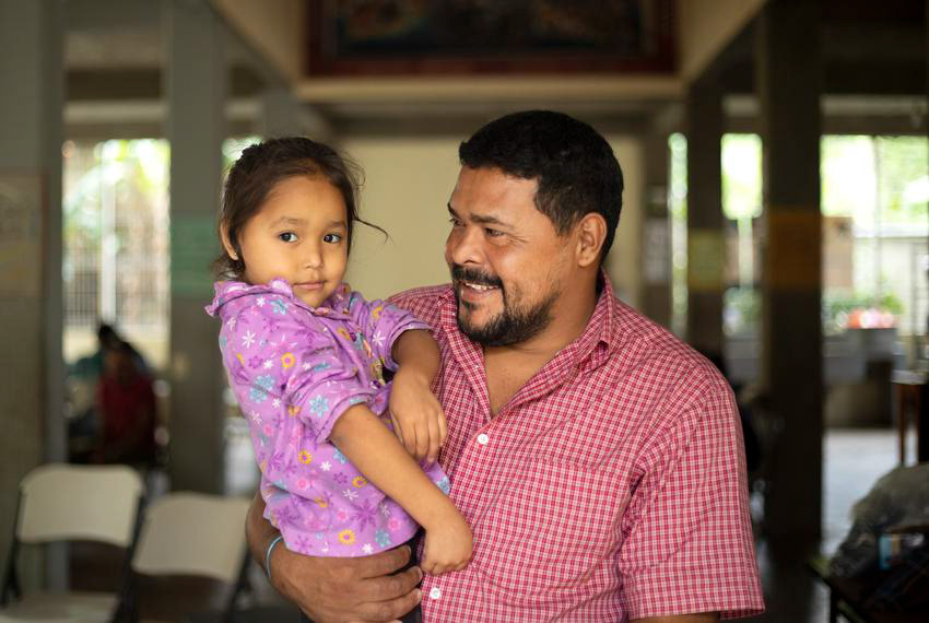
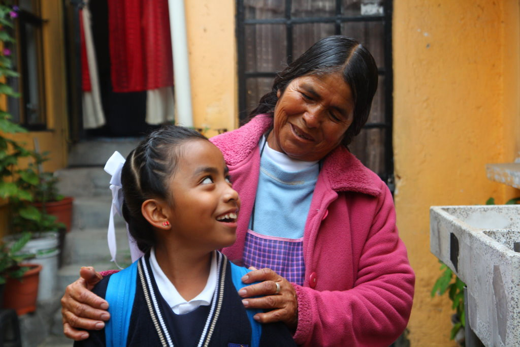


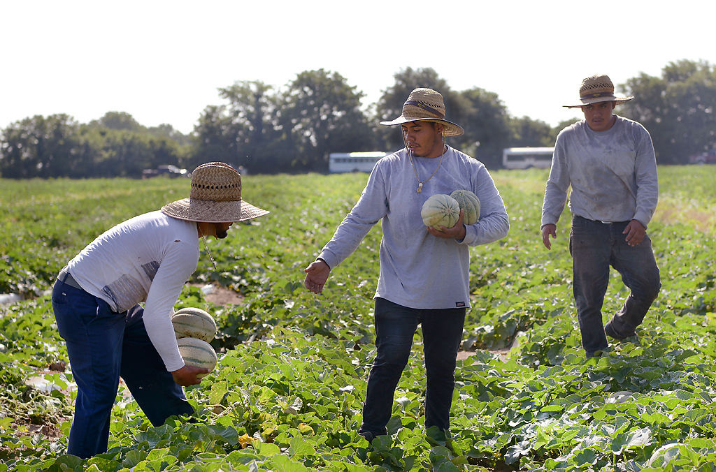
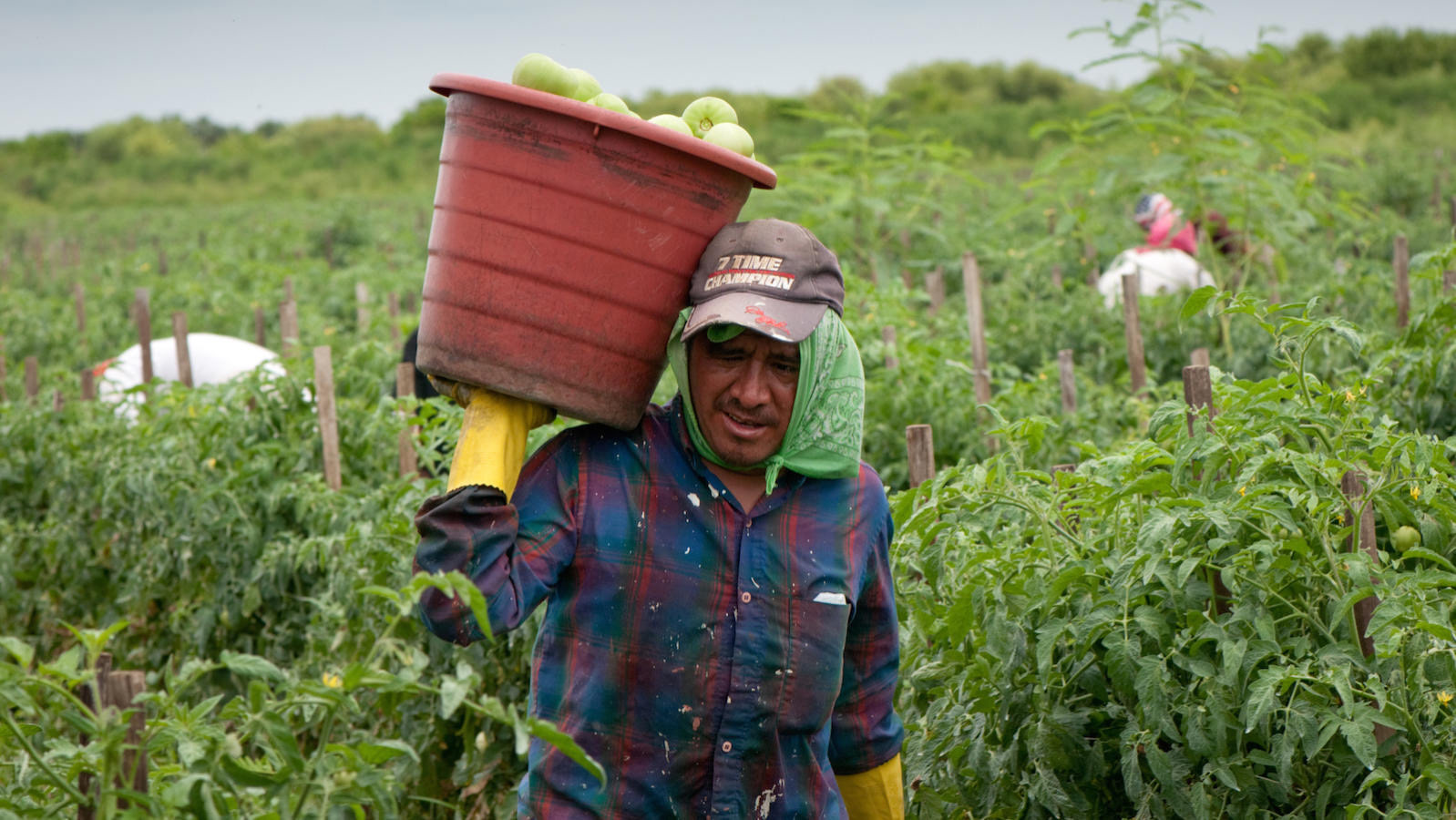
The imagery style uses a mix of two subject types, hardworking and family, to visually emphasize the values of Emigra's users. The use of photographs of real migrant workers reinforces Emigra's trustworthiness in the eyes of its users.
Tone & Voice
The verbal content of the brand experience must not only portray the values of the brand, but also be consistent across any form of communication.
Mission Statement
By navigating you through the ins and outs of finance, you’ll be ready no matter where you go.
By navigating you through the ins and outs of finance, you’ll be ready no matter where you go.
Value Statement
Our advisors, fluent in your native language and the world of finance, will be the guide to move your finances towards growth.
Our advisors, fluent in your native language and the world of finance, will be the guide to move your finances towards growth.
Vision Statement
We will be the #1 source of financial guidance for the nation’s migrant worker population.
We will be the #1 source of financial guidance for the nation’s migrant worker population.
The User's Experience
Entice
Building awareness in the user is first and foremost. Emigra's users are mobile, and therefore the outreach strategy will use online marketing to be present for the user wherever they're located.
One of the most popular social media platforms in Mexico is Facebook, so a large portion of advertising will focus on this platform.
Referencing to Emigra as a “family” helps ground the brand in reality and become a more trustworthy entity.
Due to their constant travel, Emigra will also employ the use of billboards, grabbing the user's attention while on the road.
Enter
The work and experience the users go through is already stressful and difficult, and Emigra's goal is to be understanding of their users' situations. Making a simple and understandable process is highly important.
Users of Emigra will not always speak English. While the auto-detect of device language will make things easier for the user to understand the experience upon first entry, users have control over the language in which they experience Emigra.
To cater to users who don't have frequent or regular access to the internet, Emigra will rent easily-accessible office spaces to provide physical locations across the U.S. for users to visit.
This will create an ever-present accessibility to Emigra's services, and provide a physical environment that reinforces Emigra's accesibility to its users.
To reassure skeptical users, Emigra's advisors work closely with supervisors and farmers to consult directly with migrant workers on the job.
A close relationship with trusted authority figures and a willingness to drive out to their place of work makes Emigra more accessible and trustworthy to its users.
Engage
A very important aspect to this experience is its adaptability to different media to cater to the mobile lifestyle of the user. To accomplish this, Emigra takes a two-prong approach with both physical and digital touchpoints.
To keep the user informed whether they're stationary or mobile, users can receive both mailed and emailed important documents.
For users with access to a mobile device, Emigra provides an intuitive and comprehensive mobile experience which allows them to manage everything related to their account.
This demo shows a scenario of a user depositing funds into their account via check.
It also demonstrates what happens when an action they took with their account completes.
Exit
Even outside the digital or physical setting, the user must remain involved in the experience.
To keep the user informed of every step of the process, notifications will alert the user to any changes or updates to their account.
In addition, these changes will be clearly indicated using animations and micro-interactions to provide the user with a clear understanding of what changed.
Extend
To make the experience truly comprehensive, Emigra needs to keep the user involved in the experience even after they have exited.
Users are kept informed about recent events relating to economics, migrant workers and any other relevant topics. This is done through the news section of the app, which notifies when new stories are added and keeps users engaged with the brand.
Next Steps
Expand the User Base
While a majority of the American immigrant work force is from Mexico, there are many other immigrant populations from other countries who work in the U.S. Part of Emigra's expansion would be to include those other groups into the services they provide.
